Organic is often described as the "fastest growing segment of the food supply;" however, recent data fails to support that claim.
The USDA recently released its second major survey of the US organic farming industry with data from 2011. The obvious question was "what has changed in the three years since the last big survey in 2008?" The answers are somewhat surprising (see graph and description below):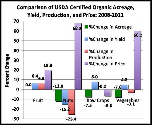
Farms: The number of farms growing most organic crops has dropped by 20-30% for most crops (not graphed)
Acres: Although the crop mix has changed, the total acres of USDA organic crops is only slightly up for fruit and somewhat down for other categories (nuts, vegetables, row crops)
Yields: The average yields for organic crop categories other than nuts are slightly up
Production: The actual production of organic crops in pounds is down for all but fruits which are up slightly
Price: The price of organic crops has risen rather significantly for all but row crops
There was too much incomparable data between the two surveys for hay and silage crops, so the following analysis focuses on human-oriented crops like fruits, vegetables, nuts and row crops like cereals and oilseeds.
Why Fewer Farms?
The fact that farms and acres are down while yields are up for many crops suggests that there has been some shifting of production to the more successful operations. I plan to look at the state-by-state detail on this in the future.
Acreage Changes
The table below lists some of the organic crops that have seen the largest absolute or relative acreage increases in the last three years:
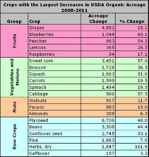
Nearly 5,000 acres of organic table grapes were added which was an 18% increase. The 1000+ acre increase in blueberries by 2011 was a 60% increase over the 2008 level. Other crops with large increases included sweet corn, broccoli, squash walnuts, flaxseed, dry beans and sunflower seed.
While there were some increases, there were also many crops for which the acreage dropped significantly over this time span (see table below).
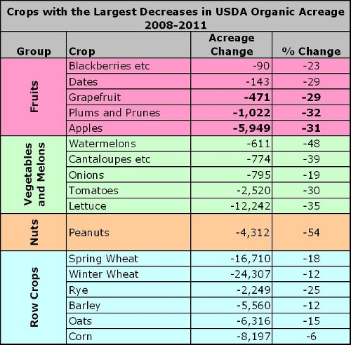
Apples, tomatoes, lettuce, peanuts and both spring and winter wheat were the organic crops with the largest acreage loss. For fruit crops overall, the acreage change was a net zero. For nuts, vegetables and row crops, the net change for the category was negative. For all these crops combined, USDA Certified Organic Acreage declined by 68,000 acres over these three years. This is in stark contrast to the historical trends. Between 1995 and 2008 the average increase had been 144,000 acres/year. Arguably this could be the result of the major recession, but as we will see later, price increases in the same time frame do not fit that hypothesis.
Production (actual pounds)
With changes in farms acres and average yields, the key question is what happened to the total production of organic crops that could then flow to consumers? Once again this is a mixed story. Some crops have seen significant increases in production (see table below).
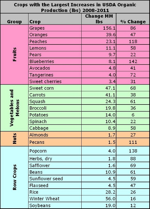
Crops like grapes, oranges, peaches, sweet corn, carrots, squash, rice and winter wheat all saw increases of over 20 million pounds over the three years. Many of these increases were dramatic on a percentage basis. However, there were also many crops that saw dramatic decreases in production (see table below).
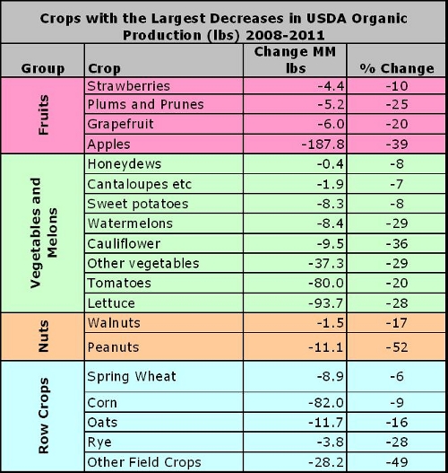
Organic apples declined by nearly 190 million pounds. Tomatoes, Lettuce, and Corn also showed major declines. Overall, for all the categories combined, there were 7.3 million less pounds of organic foods in 2011 than in 2008.
Imports, which were not captured in this survey, also contributed to the supply of organic foods available to US consumers from 2008 to 2011. For some vegetables and fruits, there were likely major supplies from Mexico and other sources. For grains, any increase in supply likely comes from much more distant origins. These including countries for which many observers have doubts about the credibility of the certification system.
Prices: What Do These Crops Cost?
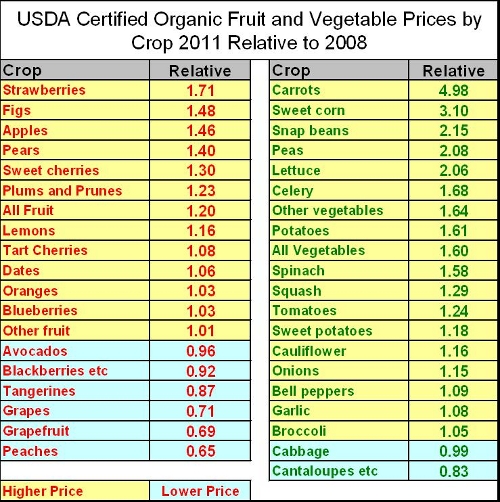
Moving from 2008 to 2011, the prices per pound that organic farmers received were higher, often significantly higher. These changes do not correlate well with production changes, nor do they fit the scenario that recession-driven limits on consumer demand had much effect on prices for organic in market. Most fruit crops saw price increases over these three years, and even more vegetable crops did as well (see table below)
All nut crops realized price increases including peanuts which saw a major overall production drop and almonds which saw a production gain (see table below).
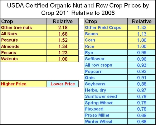
The only real losing category for organic crop prices over these three years was row crops (see particularly spring and winter wheat in the table above). Again, these crops are much more subject to long-distance competition from places like China and India. During these three years, conventional row crop farmers in the US saw significant commodity price increases, but the organic producers did not.
Any Big Conclusions?
Considering the major, crop-to-crop differences, I'm reluctant to draw too many big conclusions at this point. All that is clear is that there has not been much if any overall growth in the US, Certified Organic crop sector over the last three years except in terms of cost. I will be sending this analysis to many contacts who are knowledgeable about the organic sector and I hope to get some perspective from them and from readers of this post on the various sites where this is posted. There are almost surely crop-by-crop and region-by-region stories behind what can be seen from these data. If you know some of those stories I hope you will either share them in the comments here or via email at savage.sd@gmail.com
Comments on the Form of the Data
(This section is for data wonks. Read on if you are interested in this detail)
There has been very little if any comprehensive coverage of this new survey in the mainstream press or even in the pro-organic blogosphere. I'm guessing that this is because it is pretty hard to do the analysis. I'm not saying that the USDA has intentionally made this difficult to do, but if they wanted to make it difficult, their presentation would have been a good strategy.
First of all, there was a big difference between the two surveys. In 2008 it included both USDA Certified and USDA Exempt Organic farms. The latter is a category for farms with less than $5,000 in annual sales which don't have to go through a formal certification process and which can only use the label "Organic" not "USDA Organic." In 2011, only the USDA Certified Organic farms were included. Fortunately, the 2008 data has tables breaking out the data that way (tables 23 to 26 at this link).
The data set is designed for PDF format, so even though there are CSV versions that can be opened in Excel, the set-up of the tables requires work to put it in a form that can be conveniently compared between the years. Also there are unit changes for some crops between the years (e.g. hundred weights vs tons). For this analysis I converted everything to pounds, but I'd like to have someone check the math.
Particularly at the state level, many data cells are marked "(D)" meaning that the number of farms is too small to show the data because it would give away too much detail about specific operations. Thus, for instance, organic cotton production dropped by 60% between 2008 and 2011, but the data for value and number of farms was not given. Similarly, barley production data was not published.
The ups and downs of the organic commodities do not seem to correlate with those for the total crop in these two years (2008 and 2011).


Comments