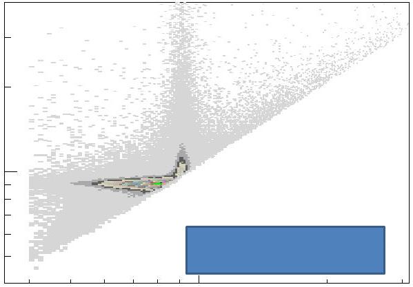
The figure below is for you to guess (ignore the blue box at the lower right -it just hides some giveaway information). What does it represent ? What is in the abscissa ? And on the y axis ? Why do the data only populate the upper left half ? And what causes those two funny concentrations ?
Please try your luck and make your guess in the comments thread! It's fun, it's free, it makes me happy to see you considered the riddle, and it adds interest to this column!

If you do not know straight away from what physical process do those data points come, you might be tempted to throw up your hands and say "It could be anything!". Well, yes and no.
Yes, in principle it could be anything -but in that case, rather than complain why don't you just offer a plausible solution? And no, actually there is only one good answer, because this is a very distinctive distribution, which upon close inspection would distinguish the process it represent from anything else.
Commenting the figure when I will give the answer to this riddle, in a couple of days, will be a pleasure for me, because there is just so much physics in this plot!


Comments