I recently got engaged in a conversation with a famous retired mathematician / cosmologist about the phenomenology of Higgs bosons in the Standard Model of particle physics, and very soon we ended up discussing a graph produced by the CMS collaboration at the CERN Large Hadron Collider, which details the result of searches of Higgs boson pairs in proton-proton collisions data.
The conversation -and in particular the trouble I had in making sense of the graph with my interlocutor- clarified to me that the way we present those graphs, which summarize our results and should speak by themselves, is confusing to say the least. Indeed, one needs to be briefed extensively before one can fully understand what the various elements of the graphs mean.
I thus decided it is time to write about the subject here. I did that already a few times in the past 20 years, but while those posts are still available and pop up easily in google searches for suitable keywords, there is a logic in repeating the explanation every once in a while....
Below you find a graph that describes the combined result of CMS searches that try to constrain one parameter of the Higgs potential in the Standard Model, called "kappa_lambda". This kappa_lambda is nothing but a number that determines the strength of a term in the Standard Model Lagrangian density connected to the so-called "tri-linear coupling" of Higgs bosons. What is that, though?
In the theory of fundamental interactions we call Standard Model, the Higgs boson exhibits a property we call "self-interaction" - it can interact with itself. For instance, two H particles can merge into one; or one H particle can split into two. All these processes need to obey energy conservation, of course, and the other rules of the quantum world; but the fact that there is a vertex to which we can add three Higgs boson lines implies that the Lagrangian density contains a term that has a cubic dependence on the Higgs boson quantum field, H^3. That term has a certain number multiplying it, which determines how probable it is that a Higgs boson splits into two, e.g. We usually call lambda that parameter in the Higgs potential.
What is kappa_lambda then? Well, we have not yet been able to measure lambda, so we hypothesize that it might be different from what the Standard Model predicts. The difference is parameterized by a multiplication factor - if that factor is equal to 1.0, we have the Standard Model proper; and if it is different, well then the Standard Model must be tweaked to account for that difference. That tweaking factor is our kappa_lambda parameter. Again, kappa_lambda = 1.0 is the Standard Model, and anything else is new physics!
Experimentally, we can study kappa_lambda by searching for pairs of Higgs bosons produced in proton-proton collisions at the Large Hadron Collider: we reason that if we see a pair of Higgs boson decays in the same collision event, this may mean that the two were the product of the splitting of a single Higgs boson created in the collision. Since they could also be the result of two independent productions of separate Higgs bosons at different points in space-time, though, the matter is a bit complicated; but we have brilliant theorists that can compute how many Higgs boson pairs we should see in our data depending on the value of kappa_lambda, after all things are taken into account. So we can eventually produce the graph below, which I can now finally show.
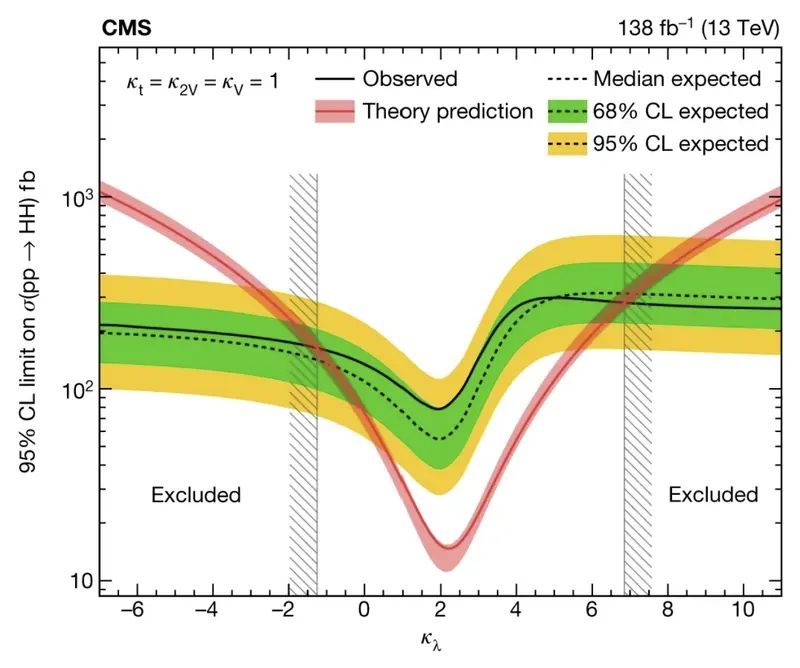
This is a busy graph, ain't it? After seeing a million such graphs in my career, it takes me some effort to realize this is the case. But just look at those curves with different colours, those cryptic labels. So much is given for granted here! So let us walk through this geroglyph.
The horizontal axis
First of all: the horizontal axis describes the value of kappa_lambda. As you can see, the first cryptic thing in this graph is that there is no special symbol evidencing the fact that kappa_lambda=1 should be what we call Standard Model. Instead, here we are fully looking into new physics theories that allow the parameter to differ from 1. In that sense, the whole graph encompasses an unnumerable infinity of new physics theories (depending on the real number kappa_lambda), and only a single point of the axis corresponds to the Standard Model!
The vertical axis
What is on the vertical axis is the next question in line. The label says "95% CL limit on sigma(pp->HH) (fb)". What is that? Let me unpack it. First of all, sigma in particle physics is often read out as "cross section" (not always! sigma can also mean the number of standard deviations of some measurement, alas! More confusion here!).
Now, the "cross section" is a number that says how frequently do I get a certain reaction. The cross section of pp -> HH tells me how frequently a proton-proton collision at the LHC (it is the LHC because we said pp, proton-proton collisions, and because the top right corner specifies "13 TeV" as the collision energy: these two things together almost[1] perfectly specify what kind of collisions we are talking about) generates two observable Higgs bosons.
Note, above I said "observable": I am not counting the frequency of all collisions that produce Higgs bosons, if those Higgs bosons then interact and generate something else. We consider the H-boson pair our "final state" of the quantum reaction, and we only allow them to decay, not interact further: this way, we are sure that we will get something we can measure in our detectors! All of that is of course accounted for in both theoretical calculations (we will get there) and in experimental efficiency calculations.
But then, what is the 95% CL limit? Ah, this is a question that would deserve a post by itself. CL stands for "confidence level". It is a concoction of classical statisticians, which allows you to describe the fact that you determined something about a parameter's potential values. When you say that your experiment proves that a number x is below a certain value x_thr: x
In the graph, CMS is saying they are not reporting their belief on the possible values of cross section for pp->HH reactions, as a Bayesian statistician would do: they instead are reporting what they estimate to be the threshold x_thr, derived in a frequentist sense. In that sense, the threshold is a "confidence level" at the stated percentage. What do you do with that? Well, nothing much, but indeed the observed limit reported by CMS is all that CMS is comfortable in reporting about the cross section value for different values of kappa_lambda.
Note that CMS could have decided to report their best estimate for the cross section as a function of kappa_lambda, instead than climbing the vertical mirror of probabilistic statements. But it is not CMS fault if they decided that way: it is an accepted procedure in the field. If you are studying a positive defined number (a cross section can only be positive, so it will be zero or larger than zero), and the central-value estimate of the number you study has uncertainty so large that it is fully compatible with being zero, then you do not usually[2] venture into publishing the central value of your fit: you rather use a statistical procedure to determine what you estimate to be the 95% CL upper limit of the quantity, given your data.
Note that what we are looking at is a declaration of failure: CMS is saying they cannot measure the cross section of Higgs pair production to have any value different from its minimum allowed (0), regardless of what assumption is made on the value of kappa_lambda; otherwise they would be quoting those central values of cross section with the estimated uncertainty, rather than reporting a limit as a function of the parameter kappa_lambda. But the search does produce an interesting result nonetheless, as it allows CMS to exclude (at 95% confidence level) some values of the parameter. We will now explain how that is so.
The theoretical band
That red band in the graph is the next thing we need to focus on. Theorists computed the frequency at which pairs of Higgs bosons can emerge as the final state of the proton-proton collision using the Standard Model lagrangian, to which they added the kappa_lambda parameter that modulates the strength of the trilinear coupling in the Higgs potential. The result is a curve: as kappa_lambda takes on different values, it affects the Higgs potential by enlarging or shrinking the relative strength of the Higgs boson self coupling, also making it negative in the left part of the graph. The non-linear behavior of the cross section as a function of kappa_lambda - the smooth v-shape of the red curve - indicates that the relationship between the kappa_lambda multiplier and the rate of Higgs pair popping up in the CMS detector is not trivial at all. But we trust them theorists on this one, so the red curve is a great summary of our understanding of the physics effect of a variation of the trilinear coupling. It should be worth a graph of its own....
In fact, it should! This is the next criticizable, cryptic subtlety in the graph above. The vertical axis in the graph speaks of a limit on the cross section, but the red curve instead is a cross section tout court, not a limit! While this is indeed confusing, once you overcome the confusion you get the benefit that you can compare what theory predicts with what values of the cross section were excluded by the experimental search... This is all about the reason for the complicated graph.
Anyway, let us move on, as we still have a lot to discuss. Before we leave the theory prediction band, please note that it has a central value and a non insignificant width. Theorists have taken care to assess what uncertainties have sept into their estimate of the cross section, through the calculation procedure. These uncertainties may have different sources; one of them is typically the mass of the Higgs boson itself, which is only known from experiment, so theorists may blame experimentalists for not giving them a precise mass of the Higgs to feed their calculations. Other factors play a role in determining how thick the red line is. To us, though, what matters is that the line is not perfectly precise, and this has repercussions on the conclusions we can draw from reading the graph. We will mention them later.
The Brazil band
The green and yellow band is produced by a calculation that the experimentalists perform before looking at the real data. They first fix the inference procedure, with simulated data; then for each value of kappa_lambda they determine what are the most likely results they should get in calculating the 95% upper limit on HH production cross section. These results, if plotted in a histogram, will distribute roughly speaking as a Gaussian distribution (it can be very different in special cases, but let us leave that aside). Then they compute the percentiles of that histogram: the 2.5% and 97.5% percentiles (roughly) determine the extension of the yellow band, and the 16.3% and 83.7% percentiles determine how wide is the green band.
This way, you can see how sensitive is CMS, with the stated amount of data, to different values of kappa_lambda. The smaller the band lays, the tighter is the expected limit going to be (as it is an upper limit, so it excludes cross sections above itself).
There is one thing about the green and yellow band which I do not like: it is really the most evident feature of the graph, while in fact it should be left out in my humble opinion. These experimentalists are really a bit arrogant in the way they present their graphs: they assume you want to know everything all at once; if they found a proper visualization tool for it, I believe they would add information on how many collisions they studied to cook up the graph... Wait a minute, they do: it is the "138 fb-1" specification at the top right. So you get the point.
What I am complaining about, though, is soon explained: the brazil band has no role in the conclusions you can draw on the likelihood that kappa_lambda has one certain value or another, which is the stated purpose of the graph overall. That is, it has no role once you assume that you trust the experimentalists in reporting an upper limit. For the band reports what is the range of expected upper limits that the data and inference extraction procedures deployed by CMS overall warrant. If the observed upper limit (black line, we will discuss it next) were e.g. far below the green and yellow band, then the graph itself would sort of lose some of its purpose, because you would have to reckon with the possibility that there was a mistake in the calculation.
A mistake?! The horror, the horror. No, this is not in the menu. We will never assume somebody can have made a mistake. But indeed, if the observed and expected results differ wildly, then one is justified in taking a step back, and say "wait a minute - you want me to use these upper limits in the Higgs pair production cross section as an indication of what values of kappa_lambda are possible or disfavoured, but the departure of observed and expected limits indicates that there is something we do not understand in the data!".
So, the expected band in green and yellow is a sort of "feel-good" addition to the graph: the fact that the observed upper limit (black curve) stays on top of the band means that things are in good order, and that the graph can indeed be used for its intended purpose without worrying about something going on in the data which might prevent us from doing so in a logical sense.
There are another couple of uses in the band I will mention here for completeness. If the observed curve went far above the band, for some specific value of kappa_lambda, this might mean that there is a signal of Higgs pairs in the data, if one assumes that kappa_lambda value. As the variation of kappa_lambda produces in the Standard Model a rather smooth effect in the rate of Higgs pairs you should see, though, this is unlikely to happen. More likely would be to have the full observed line above or below the band. Indeed, you do not see the black line wiggling much around the expectation band: this indicates that the calculation sort of correlates all values of the upper limit to one another.
The exclusion region in kappa_lambda
We have gotten to discuss the observed upper limit (the black curve), which is the actual result of the CMS measurement. That curve is computed with the real data. It stays on top of the brazil band (good), so we trust there is nothing fishy going on anywhere. It also does not wiggle around much, which betrays the fact that the limit is strongly correlated along the horizontal axis: the CMS data is not very sensitive to different values of kappa_lambda, so if it produces an upper limit at some value for a given hypothesis of kappa_lambda, it is likely to produce a similar upper limit for nearby values of the parameter.
But how is an exclusion obtained in kappa_lambda from an upper limit on the Higgs pair production cross section? Well, here the interplay of the red band and the black curve is at play. We take the intersection of the theory band with the black curve, by making a convolution of the uncertainty on the theory (I may be wrong on this bit, so bear with me if a different technique is used here). This determines regions of the horizontal axis where the curve is below the theory calculation: those regions of the kappa_lambda axis are allowed by the data, while all the others are excluded at 95% confidence level.
The reasoning is the following: if for an assumed value of kappa_lambda I exclude a cross section of y femtobarns (by reading out the height of the black curve at that value of kappa_lambda), then if the theory prediction at that point is above y I can consequently conclude that kappa_lambda cannot have that value. Do it for all values of kappa_lambda and you get the regions shown by the dashed grey vertical lines. The CMS measurement can thus exclude that kappa_lambda is below -1.25, or above 6.8, at 95% confidence level.
The devil is in the details
Just when you thought you got the grips with the graph, and were ready to announce to the world that kappa_lambda cannot be smaller than -1.25, there comes a cold shower. The upper left corner indicates an ominous small-font disclaimer: all conclusions are only valid if you assume kappa_t, kappa_2v, kappa_v all equal 1.0. But what are these?
They are other parameters that you can add as multipliers of other terms in the Higgs potential of the SM lagrangian density. Higgs pair production depends on all of those, so if you were to assume that one of them changed, say from 1.0 to 2.0 or whatever, then the theoretical dependence of the cross section on kappa_lambda (the red curve) would change!
What I am saying is that there are in fact multiple parameters that can affect the production of Higgs boson pairs. If you just measure the rate of Higgs boson pair production you cannot disentangle their effects, so your conclusions on any one of the parameters is only valid if you fix all others. Does this make the plot utterly useless? Well, that is for you to decide, but you should learn more about the Higgs potential before you do it. But indeed, it is a big caveat emptor to keep in mind![3]
Conclusions
I think the above long discussion - which is already a condensed summary of all the ingredient of the busy plot we considered today - should make you approach similar graphs with care. Particle physics is fun, but it is also a complex business!
Notes:
[1] I said "13 TeV pp collisions almost perfectly specifies the kind of reactions" because in principle a collider could produce collisions between polarized beams, when the reactions could differ slightly. Again, the devil is in the detail!
[2] In truth the situation is more complex: when measuring a parameter which can indeed have a value different from zero without the fact being a true discovery, we are more relaxed and do quote the number even if the uncertainty bars include zero or they are close to it. The reason for that is that in the latter case by letting out the full information we allow for combinations of that measurement with others that competing experiments may be producing. Instead, if we are measuring the cross section for a new phenomenon which the SM does not allow, we shy away from quoting a number if it is compatible with zero, and wait until our result is a full five sigma away from zero.
[3] I would like to stress this point: the plot I presented span only one of the dimensions of potential new physics theories that would affect the effective value of those coupling modifiers. And since any value of kappa_lambda different from 1.00000 is new physics, the graph is a bit redundant. In a sense, the dimension we are looking at loses any interest for kappa_lambda different from 1.0, because if kappa_lambda = 0.9 (say), then it is completely meaningless to assume that all the other coupling modifiers magically still stick to the Standard Model (=1.000, 1.000, 1.000): a theorist would have to come up with a very oddball concoction of an extension of the Standard Model where only the trilinear coupling is at odds with the SM value, but all others remain untouched.