Regular SAR works by firing a pulse of radio waves towards the Earth, and timing how long it takes to return. Just like SONAR or the radar used in airports, this time can easily be turned into a distance as we know how fast radio waves travel (the speed of light). However, uncertainties in the position of the satellite and atmospheric mean we can only usually calculate the height of any given bit of the Earth to an accuracy of about 10 metres. To do better we use a trick that scientists often use: rather than measure the absolute height of the bit of ground we are interested in, we can measure how much its height has changed relative to an earlier measurement. Relative measurements are used all the time in science because they can help to reduce uncertainty; many of the errors that affect the first measurement will be the same in the second, and clever manipulation can cancel these out to give a more accurate answer.

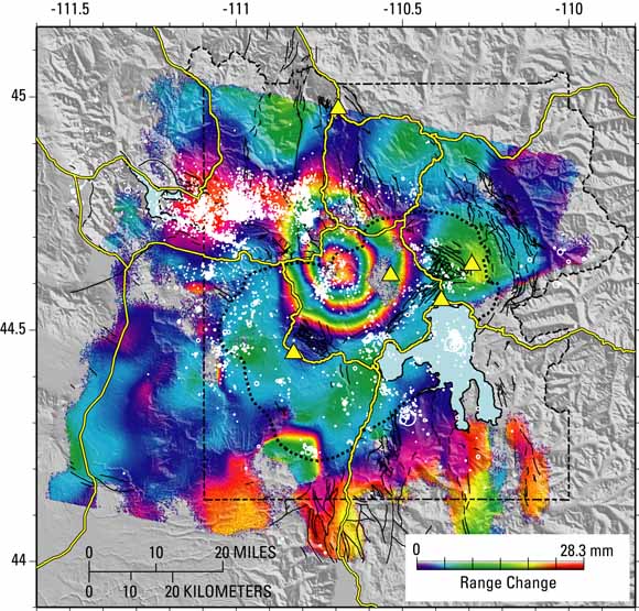
InSAR picture of Yellowstone, showing deformation that occurred between 1996-2000. Image credit: USGS.
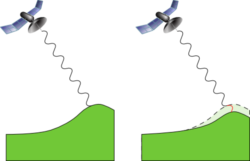
Turning to InSAR, there is another clever trick we can use. When the radio waves arrive back at the satellite two pieces of information can be retrieved (along with the time taken): the amplitude and phase. The amplitude is how "high" the wave is, how strong the signal; and the phase is how far along the cycle the wave is. It is the phase that is used for InSAR. The sketch below shows two SAR measurements, made a short time apart. In between, the ground has subsided. As well as taking slightly longer to return, there is now almost half a cycle extra between the satellite and the ground, so the phase will also be different. InSAR takes the phase difference at every point on the ground it measures, and the brightly coloured picture above is what you end up with.

Sketch showing how InSAR works, obviously not to scale.
So how do you go about interpreting that picture? The phase difference between the two SAR images that make up that one InSAR image is colour-coded, from no difference in violet to one cycle in red. Because waves repeat, and each cycle is the same as the one before, we can't tell the difference between one cycle difference and two or three or four cycles difference in the path length in the before and after images. All we have is the extra difference after we take off all the whole number of cycles. However, we can still calculate the uplift. If we assume that at distance from the centre of the deformation the ground has not moved, we can count the number of rings, or fringes. Each time we go past another fringe, that is another whole cycle of difference. In the picture above of Yellowstone there are almost three fringes between the edge and the centre of the deformation. If we know the wavelength, or the length of each cycle, then we can turn the number of fringes into an actual distance. Doing this we mustn't forget that the total distance travelled by the radio waves is twice the distance between the satellite and the ground (there and back again). A common wavelength used for InSAR is 5.66 cm, and using that above gives an uplift of about 7 cm over four years.
Of course this is a bit of a simplification. One of the biggest points that I skipped over above is that the change in distance is in what is known as the Line of Sight (LoS). Because SAR images are not taken pointing directly downwards, but rather at an angle, movement in both the vertical and horizontal directions will change this LoS distance. In order to split the two, we really need two InSAR images taken from different directions. Fortunately for us, this is not difficult. The satellites that take InSAR pictures are usually in what's know as a polar orbit, that is the travel from the South pole up to the North pole, and then back down the other side. On the ascending path, the satellite takes a photo to the right, looking east. Twelve hours later, the Earth has rotated and the photographed spot is now under the satellites descending path. Now when it takes a photo to the right it is looking west. These two images can be used to clear up any ambiguity in how much uplift there has been.
The large coverage of InSAR makes it ideal for monitoring remote volcanoes. Without InSAR we wouldn't know about the spectacular uplift occurring at Uturuncu in the Andes, for example. The great spacial resolution also allows us to see the shape of the deformation. In the image above we can see that the inflation is dome shaped. This can be used to constrain the processes responsible: is it intrusion into a magma chamber, or a dyke for example. It can also be used for measuring the ground deformation after earthquakes, which can then be used to reconstruct how and where the fault moved.
A major disadvantage is that in order to get a good image, without too much noise, there needs to be little change in the ground unrelated to the overall deformation. Vegetation is a particular problem, as it reflects radio waves and will do so differently in two different SAR images. This rules out InSAR for many parts of the world. InSAR works best in arid areas, and to a lesser extent in urban areas.
Another disadvantage of InSAR is that it cannot give much information on how the deformation varies with time. Although the SAR satellites pass over every spot on the Earth twice every day, in order to get a good estimate of the deformation you need at least a few fringes. For slowly deforming areas like volcanoes, this limits us to relatively long time intervals between useful images. However, combining the spatial data of InSAR with more rapid but more local measurements made by GPS or tiltmeters allows us to view how the deformation occurs in both time and space.
Since the first, landmark paper by Didier Massonnet et al. (pdf) almost 20 years ago, InSAR has been a remarkable tool. Both vulcanology and seismology have learnt a great deal from being able to see the patterns the ground makes when it deforms, and it still blows my mind a little when I realise that we can map out centimetres of deformation from space.


Comments