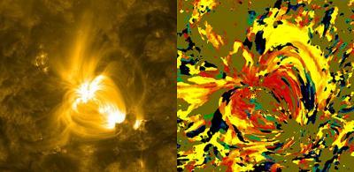
Nicholeen Viall, a solar scientist at NASA's Goddard Space Flight Center in Greenbelt, Md., creates images of the sun with broad strokes of bright color splashed across a yellow background. But it's not simply art. The color of each pixel contains a wealth of information about the 12-hour history of cooling and heating at that particular spot on the sun. That heat history holds clues to the mechanisms that drive the temperature and movements of the sun's atmosphere, or corona.
Scientists generally agree that energy in the roiling magnetic fields of the sun must transfer energy and heat up into the atmosphere, but the exact details of that process are still debated. Viall created her technique to see if she could distinguish between theories that describe coronal heating as uniform over time, versus those that say it comes from numerous nanoflares on the sun's surface.

Left image was captured by NASA's Solar Dynamics Observatory (SDO) on June 19, 2010, the image shows the area in the wavelength of 171 Angstroms, which has here been colorized in yellow. Credit: NASA/SDO Right is a visualization based on the image on the left which uses specific colors to describe which areas on the sun cooled or heated over a 12-hour period. The use of reds and yellows imply that higher temperatures dominated earlier in the time period, while lower temperatures dominated later, meaning that the area showed steady cooling over time, but any heating happened too quickly and impulsively to be measured. The image compares wavelength 211 (which shows material in the 2 million K range) to wavelength 171 (which shows material about ten times cooler). Credit: NASA/Viall
"We don't understand why the corona is so hot," says Viall who wrote about this technique and her conclusions about the corona in a paper that appeared in The Astrophysical Journal on TK date. "The corona is 1,000 times hotter than the sun's surface, when we would expect it to get cooler as the atmosphere gets further away from the hot sun, the same way the air gets cooler further away from a fire."
To look at the corona from a fresh perspective, Viall created a new kind of picture, making use of the high resolution provided by NASA's Solar Dynamics Observatory (SDO). SDO's Atmospheric Imaging Assembly (AIA) provides images of the sun in 10 different wavelengths, each approximately corresponding to a single temperature of material. Therefore, when one looks at the wavelength of 171 Angstroms, for example, one sees all the material in the sun's atmosphere that is a million degrees Kelvin. By looking at an area of the sun in different wavelengths, one can get a sense of how different swaths of material change temperature. If an area seems bright in a wavelength at shows a hotter temperature an hour before it becomes bright in a wavelength that shows a cooler temperature, one can gather information about how that region has changed over time.
To study such temperature changes, many scientists focus on analyzing a specific subset of solar material, such as giant arcs of charged particles that leap up off the sun's surface called coronal loops. Scientists gather information about the loops by comparing nearly simultaneous images of the sun in different wavelengths. Analysis of the loops in each image requires time-consuming, manual analysis to subtract the background observations away from the loops themselves, a process which is also inherently subject to human judgment and bias. In addition, each individual image represents light from only a narrow range of wavelengths, representing material at a narrow range of temperatures.
Viall wanted to look at as much of the solar material in a given area of the corona as she could, incorporating information about a variety of temperatures simultaneously. She also wanted to avoid the subjective process of subtracting out the background. Instead, she decided to look at all light coming from a given spot on the sun at the same time. That meant coming up with a visualization technique to convey all that information at once -- and thus her Van Gogh-like images were born.
For an interesting spot on the sun, Viall examines six channels over an entire 12-hour stretch. She compares each channel to the other channels in turn, assigning it a red, orange, or yellow color if the area has cooled, and assigning it a blue or green color if the area has heated up. She assigns the exact shade of the color based on how much time it took for the temperature change to occur.
"In essence, I'm measuring the time lag of how long it takes a given area to heat up or cool down," says Viall. "But it's totally automated, with no need for humans to make a decision about what to incorporate or ignore. And all of the solar material is represented statistically, not just one wavelength of light."
Viall's images show a wealth of reds, oranges, and yellow, meaning that over a 12-hour period the material appear to be cooling. Obviously there must have been heating in the process as well, since the corona isn't on a one-way temperature slide down to zero degrees. Any kind of steady heating throughout the corona would have shown up in Viall's images, so she concludes that the heating must be quick and impulsive – so fast that it doesn't show up in her images. This lends credence to those theories that say numerous nanobursts of energy help heat the corona.


Comments